Hey—we've moved. Visit The Keyword for all the latest news and stories from Google

Less than a year ago, we announced the Android Developer Challenge, a two-part contest for developers to design engaging, innovative mobile applications for Android to the tune of $10 million total in awards. Since the kickoff of the first part of the contest (ADC I) last November, we've been eagerly waiting to see what these brilliant minds would come up with. The first round of ADC I closed earlier this year, awarding the top 50 entrants with $25,000 each. Today marks the closing of the second and final round of ADC I, in which 10 winners will receive $275,000 and 10 semi-finalists will be awarded $100,000. We'd like to wish a hearty congrats to all the award recipients ...
Less than a year ago, we announced the Android Developer Challenge, a two-part contest for developers to design engaging, innovative mobile applications for Android to the tune of $10 million total in awards. Since the kickoff of the first part of the contest (ADC I) last November, we've been eagerly waiting to see what these brilliant minds would come up with. The first round of ADC I closed earlier this year, awarding the top 50 entrants with $25,000 each. Today marks the closing of the second and final round of ADC I, in which 10 winners will receive $275,000 and 10 semi-finalists will be awarded $100,000. We'd like to wish a hearty congrats to all the award recipients!

Visit the Android Developers blog to read more about the finalists' projects, and check back for updates on ADC II.

In countries like India, great maps and comprehensive local data are hard to come by. And traditional mapping approaches are stretched to the limit in such environments, where infrastructure and local businesses are evolving at a furious pace.

This need inspired us in Google India to design and build Google Map Maker, which enables users everywhere over to create rich, deep maps and fresh local data. People can mark their favorite spots in their cities and hometowns, add features such as roads, parks, and buildings, tag small businesses to help users find them, and collaborate to map neighborhoods of interest. This product is motivated by the spirit of information democracy, where people can create information that are moderated and consumed by their peers.

Today, we are bringing home this innovation by launching Google Map Maker in India, which has already been deployed in 57 other countries.


We hope Google Map Maker will result in rich local data which will benefit Google users both on the web and on mobile. The creation of base maps where there were previously none will encourage many mashups, mapplets and other cool applications that make use of this data. We're also excited to see Google Map Maker create a new breed of local map experts who bring their passion for their neighborhoods and communities into the online world, adding to local commerce, tourism and investment.

I will leave you with a map of IIT Bombay, the alma mater to many of us in Google India. When I spent a few hours mapping IIT Bombay -- the place I lived in, the school I went to, and the streets I played on, it turned out to be a surprisingly satisfying experience that reconnected me to a place that is home to many of my memories. We hope you will find the Google Map Maker experience as fun and fulfilling as we do.


Back in May, we introduced a site called Google for Non-Profits, to showcase the tools organizations can use to raise funds and collaborate easily and efficiently. These tools, we hoped, would enable non-profits to focus less on creaky email systems or lost documents -- and more on their missions.

For at least one non-profit, this was old news. Months before we unveiled our non-profit site, Marianne Clauw, who chairs CASA Washtenaw, an organization pairing volunteers with children in the local court system -- learned about Google products through an employee in our Ann Arbor office. With a website that she now compares to a "dusty storefront" and data sitting in a "scarily unsecure, un-backed up" state, she remembers, "I could see right away that we needed to switch to Google services."

Clauw and her colleague Ferlie Yruma used Google Page Creator (now Google Sites) to develop a shiny new website, complete with a YouTube video, a Google Calendar that reflects real-time updates, and a Checkout button allowing users to donate with a few clicks of a mouse. They applied and earned a Google Grant to run free AdWords advertising. As volunteer applications and donations trickled in, they began using Gmail and Docs to streamline the way they worked internally.

Here's what they have to say about the experience:


"Non-profits are not competitive by nature,” observes Clauw. “But we live in a competitive landscape: for donors, for volunteers, for grants. What we've done with Google is a major step in being competitive.”

When CASA Washtenaw competes at a high level, Washtenaw County kids win. And for this non-profit, that's the biggest prize of all.


At a time when more and more digital technologies are becoming indispensable to millions of people, the field of computer science (CS) is in trouble. Enrollment and retention of CS students, particularly those historically underrepresented in the field (women, African-Americans, Native-Americans, and Hispanics) has declined sharply. According to the ...
At a time when more and more digital technologies are becoming indispensable to millions of people, the field of computer science (CS) is in trouble. Enrollment and retention of CS students, particularly those historically underrepresented in the field (women, African-Americans, Native-Americans, and Hispanics) has declined sharply. According to the Computing Research Association, CS enrollment in the U.S. was at its peak in 2000, with 15,958 undergrads. By 2006, enrollment declined by roughly half: 7,798 undergrads. And enrollment among already-underrepresented groups has dropped even more sharply.

We hope to address this problem (and potential shortage) with a variety of programs beyond our scholarship initiatives. Recently, our educational outreach group, University Programs, and Diversity and Talent Inclusion teams joined forces to create the Computer Science Summer Institute (CSSI). This special institute included an interactive and collaborative CS curriculum, as well as a living-learning residential experience for student networking. We chose 17 college sophomores, all aspiring computer scientists, to attend the all-expenses-paid CSSI in Mountain View from August 3–15.

Our goals for the institute:
  • To enrich the skills of students early in their CS studies (or at risk of leaving the major) in an effort to increase the pipeline into the CS major and boost retention
  • To provide a social and professional network for underrepresented (women, Hispanic, African-American, and/or Native-American) technology students
  • To empower students, giving them the tools, motivation and confidence to continue with CS studies
  • To show students daily life at Google and the amazing applications of CS that occur here
The CSSI faculty was comprised of Google engineers and our educational outreach group. We paired students with Google "buddies" - engineers with whom they can develop a long-term advising relationship. Students heard from professionals from across the technology industry and academia about the many things they can do with a CS degree.

Students worked in teams to build a completely interactive Web 2.0 website, keeping in mind both practical programming skills and the theory behind it.

We plan to keep in touch with these students across their college careers, and to encourage future participants to complete their CS work and join the community of computer scientists.


Late last year, we introduced our newest tool for YouTube's content identification and management system, Video ID. While we have long provided copyright owners with similar content policies and tools ...
Late last year, we introduced our newest tool for YouTube's content identification and management system, Video ID. While we have long provided copyright owners with similar content policies and tools, Video ID was revolutionary because it provided real choice and control to content owners by combining a sophisticated policy engine with cutting-edge video matching technology. With the other tools in our content ID system, Video ID helps content owners decide exactly what they want done with their videos, whether to block, promote, or even—if a copyright holder chooses to license their content to appear on the site—monetize them.

We've been curious to see what copyright holders would choose. Would the vast majority of partners block user-uploaded videos? Or would they embrace Video ID as an opportunity to generate revenue and exposure for their content online?

As it turns out, our partners are choosing the latter, monetizing 90% of all claims created through Video ID. This has led directly to a similarly significant increase in monetizable partner inventory, as our Video ID partners are seeing claimed content more than double their number of views, against which we can run ads. This means that if a partner has, say, 10,000 views of its content, leaving up videos claimed by our system will lead to an average additional 10,000 views of that same content. We call this "partner uplift," and for some partners we've seen uplift as high as 9000%.

Access to our copyright management tools is open to all rights owners, regardless of whether they choose to license their content to YouTube. But it's clear to our 300+ Video ID partners that our technology has created a framework that allows copyright holders to sanction the creativity of their biggest fans. These partners now have a new way to successfully distribute and market their content online, and with the help of our users, they are finding Video ID critical to discovering such opportunities.

You can learn more about our content identification and management system on its new home page.

In my previous post, I described the components of your web search experience and the principles behind creating a great search experience. There are complex algorithms underlying simple features such as spelling correction and the two line snippets that describe each search result. We figure out what works by running experiments - tiny tests for a small number of users which help us determine whether that feature helps or hurts.

Experimentation is a very powerful tool, and we use it very widely to test potential changes to search. At any given time, we run anywhere from 50 to 200 experiments on Google sites all over the world. I'll start by describing experimental changes so small that you can barely tell the difference after staring at the page, and end with a couple of much more visually obvious experiments that we have run. There are a lot of people dedicated to detecting everything Google changes - and occasionally, things imagined that we did not do! - and they do latch on to a lot of our more prominent experiments. But the experiments with smaller changes are almost never noticed.

For example, can you tell the difference between the two pages below?

Choice 1:

Choice 2:

I'm pretty sure I would not be able to tell the difference if I were to see each of them on their own. But apparently you can! At least in the aggregate, there is a measurable difference with a change like this. In case you can't tell after staring, the white space around the first search result has changed, which makes the first result in Picture 2 slightly more visually prominent. This visual prominence conveys the fact that according to our ranking signals, the first result is a substantially better match than the next result. On the plus side, it helps you focus on the first result. But if you were looking for one of the other results, it can disrupt your scanning of the page. An experiment helps us determine which effect is more prominent, and whether a change would help you search faster.

Another change, almost as minimal visually, is between these two results:

In this case, the difference in user interaction is so clear and marked we could tell extremely quickly which one worked better: the difference is in the thickness of the plus box next to the stock quote. Now, coming to the conclusion that one is "better" is tricky, and there's many a possible slip on the way there. Does more interaction with the plus box mean that it is better? How about if users then miss good results because they are distracted by the more prominent plus box? Keep watching Google to see which version won! If we've done our job right, almost without your noticing, things will work just that little bit better for you. The world will seem rosier. Birds will sing. Or maybe not - but at least you will have the best-designed plus box we can come up with :)

Okay, so not all of our experiments are insane eye tests. My main point in highlighting the above experiments is that we test almost everything, even things that you would think are so small that we could not possibly care (nor could they possibly matter). In fact, small changes do matter, and we do care.

Another class of experiments have to do with changes that are not purely visual, but rather involve changes to the underlying presentation algorithms. For instance, the algorithm that is responsible for the titles and snippets of result pages now highlights stems and some synonyms of the original query term. For the query [hp printer drivers] we will also return results that include and highlight the word "driver".
This sort of "stemming," as it's called, is generally a good idea, because it helps you better identify results that match your query, but not always. Experiments of this sort help us verify (or, occasionally, overturn) our assumptions regarding changes in these algorithms.

There is a further class of experiments - the kind that are hard to miss - which introduces fairly prominent features. Even with these larger features, the goal of experimentation always remains the same: are we adding something that really helps people, or is this just another distraction? Google does not really come with a user manual (actually, there are some nicely-written help pages, but we're pretty sure most of you don't bother to read them!). So features need to stand on their own feet, without the help of a careful explanation. Part of the goal of an experiment is to understand just how a feature will be used, which might be quite different from what we initially intended.

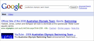
Here's an example of an experiment that lets you comment on search results and move them around on the result page:

At this point, I can't say what we expect from this feature; we're just curious to see how it will be used.

These are a small sample of the kinds of experiments we run as we test everything from the barely visible to the glaringly obvious. So the next time you use Google and it seems a little different - well, maybe it is. Just for you!

Posted by Ben Gomes, Distinguished Engineer

Have you ever been stumped in finding the right words to search for? Back when I was planning my wedding, I had a list of wedding songs in mind, but the problem was that I couldn't remember any of the artist names or song titles. So I started typing into the Google search box parts of the lyrics that I did remember -- and like magic, I saw suggestions with the artist name and song titles that I wanted! (I was opted-in to the ...
Have you ever been stumped in finding the right words to search for? Back when I was planning my wedding, I had a list of wedding songs in mind, but the problem was that I couldn't remember any of the artist names or song titles. So I started typing into the Google search box parts of the lyrics that I did remember -- and like magic, I saw suggestions with the artist name and song titles that I wanted! (I was opted-in to the keyword suggestions Google Labs experiment at the time). At that moment, I was so proud to be working on Google Suggest, a search feature that provides real-time suggestions while you search.

Today we're excited because Google Suggest will be "graduating" from Labs and available by default on the Google.com homepage. Over the next week, we'll be rolling this out so that more and more of you will start seeing a list of query suggestions when you start typing into the search box.

We find that by providing suggestions upfront, we can help people search more efficiently and conveniently. Below are some great ways Google Suggest can help simplify your searching.
  • Help formulate queries: Instead of just typing [hotels in washington] - did you want [hotels in washington dc] or [hotels in washington state]? Don't remember that song title or person's name? Let Google help you search (and yes, I ended up choosing "From This Moment" as our wedding song).
  • Reduce spelling errors: Since suggestions are spell-corrected using the same "Did you mean?" feature that offers alternative spellings for your query after you search, misspellings and typos can be corrected ahead of time. Instead of wasting your time with a misspelled query like [new yrok times] or [tomorow never dies], search the first time with the correctly-spelled query.
  • Saves keystrokes: Who wants to spend their time typing [san francisco chronicle] when you can just type in "san f..." and choose the suggestion right away?
The Google Suggest feature originally started as a 20% project in 2004, and has since expanded to Google Labs, Toolbar, Firefox search box, Maps and Web Search for select countries, the iPhone and BlackBerry, YouTube, and now Google.com. Special thanks to my teammates Miki Herscovici (Tech Lead) and the rest of the engineering team in Haifa for their hard work in making this happen.

So what are you waiting for? Give it a try. Start typing in a query on Google.com to see Google Suggest in action!

Update: Corrected team mention.

Posted by Jennifer Liu, Product Manager

As many of you know, the 2008 U.S. political conventions--two weeks of party business that begins for the Democrats in Denver today, and for the Republicans in Minneapolis next week--marks the beginning of the general election season. To help you stay informed and engaged in the upcoming election, we're launching a one-stop shop for political information ...
As many of you know, the 2008 U.S. political conventions--two weeks of party business that begins for the Democrats in Denver today, and for the Republicans in Minneapolis next week--marks the beginning of the general election season. To help you stay informed and engaged in the upcoming election, we're launching a one-stop shop for political information: www.google.com/2008election.

Can't make it to Denver or Minneapolis? Go to our conventions site to view the latest news, videos, photos and blog posts. See what the candidates are saying about the issues that concern you by using Elections Video Search, which lets you search across all of the candidate speeches and videos by word. If you want to see what the Obama or McCain campaigns and other political journalists are reading, check out Power Readers in Politics and subscribe to get daily snippets. You can also interact with a wide variety of political mash-ups in the Google Maps Elections Gallery. If you're a teacher, inform your students about the political process with our Election Toolkit for Teachers. If you happen to be running for office yourself, or are blogging about various campaigns, go to our Campaign Toolkit to find out how you can use online tools to raise money, follow the campaign trail or spread your influence.

And as election day grows closer, we're working on ways for you to find local voter registration sites or polling places on demand -- stay tuned for more details on that.

We're excited to be a part of this exciting election season, where technology is playing a groundbreaking role in connecting candidates and voters.

Posted by Rick Klau and Brittany Bohnet, Google Elections Team

It's back-to-school season in the U.S. and social studies teachers everywhere are excited about the November elections and all of the ways that politics has evolved since even just four years ago. Technology is advancing. Internet fundraising has brought all kinds of new small donors into the political process, social networking is helping campaigns and citizens organize themselves in new ways, and YouTube, which didn't even exist four years ago, has ...
It's back-to-school season in the U.S. and social studies teachers everywhere are excited about the November elections and all of the ways that politics has evolved since even just four years ago. Technology is advancing. Internet fundraising has brought all kinds of new small donors into the political process, social networking is helping campaigns and citizens organize themselves in new ways, and YouTube, which didn't even exist four years ago, has swept the political dialogue.

With technology producing such dramatic changes in American politics, we want to make sure it's easy for teachers to bring some of the best Internet tools into the classroom to help students get engaged. Working with the National Student/Parent Mock Election, we've pulled together a site called Elections Tools for Teachers where you can find descriptions and suggested learning activities for tools like YouTube, Google Maps, Elections Video Search and Power Readers, which we announced here yesterday.

We want students to walk away from their engagement in this election with a sense of excitement about our democratic process and with the belief that their voices matter. As Gloria Kirshner, president of the Mock Election has said, "In the classrooms of today are the Presidents, Senators, Congress members and, most important, the voters of tomorrow. Whether we are sending these children to the White House or to the polls, we hope to send them with a deep understanding of 'government of the people, by the people, and for the people.'"

Please let us know if you find Elections Tools for Teachers helpful in your teaching, and we hope you'll enroll your students in this year's National Mock Election on October 30th.

The global nature of our mission is reflected in the phrases the "world's information" and "universally accessible." To this end, you may have recently read about our 40-language initiative and ...
The global nature of our mission is reflected in the phrases the "world's information" and "universally accessible." To this end, you may have recently read about our 40-language initiative and the story of a community coming together to develop Google search in the Maori language.

Following on this theme, we'd like to highlight a few new products that enable a better online experience for Tamil speakers around the world.

First, we just released Google News in Tamil. Like other Google News editions, we gather stories from the various Tamil news sources on the web and present an automatically- generated summary with links to the most important stories in each section.

We recognize that it can sometimes be hard to enter Tamil text with existing keyboards. Our transliteration technology enables the conversion from English text to phonetically equivalent text in Indian languages. For example, using transliteration, you could type "vanakkam" and we would convert it to Tamil script as வணக்கம். We have embedded this technology in several Google products to make it easier to enter text in Tamil.

Google search in Tamil enables users to start typing in English and automatically get query suggestions in Tamil. If you wanted to enter the query "ponniyin selvan" in Tamil, just start typing it in English - e.g. "ponni" and we will show the Tamil suggestions:


Tamil transliteration in Blogger is designed for bloggers publishing content in Tamil when using the English keyboard for text entry. It's our hope that this will make Tamil content more popular and more easily available online.

Tamil transliteration in orkut makes it easier to communicate with friends and family by exchanging scraps in Tamil.

We hope that each of these products will help to bring the benefits of the Internet to the millions of Tamil speakers in India and elsewhere.

We're reading a lot about the candidates and the media this election season. But what are they reading? At google.com/powerreaders now you can track the news sites and blogs Barack Obama and John McCain read (from Drudge to The Daily Show) and follow articles catching the eyes of leading political journalists. Both the McCain and Obama presidential campaigns and leading political journalists are using Google Reader to keep up with their favorite new sites and blogs as well as share articles that interest them. You can follow shared articles and blog posts, or you can add participants' reading lists or shared news feeds to your own Reader account.

We're pleased to include the following contributors in our launch:
  • Obama and McCain campaigns
  • Mike Allen, POLITICO
  • Chuck DeFeo, Townhall
  • John Dickerson, Slate
  • Mark Halperin, TIME
  • Arianna Huffington, Huffington Post
  • Ruth Marcus, Washington Post
  • Jon Meacham, Newsweek
  • Patrick Ruffini, The Next Right
Visit google.com/powerreaders to stay up to date on what the political gurus are reading -- so you too can become one by November.

For quite some time we've been talking about the potential of the unused airwaves between broadcast TV channels ("white spaces") to provide affordable, high-speed wireless Internet connectivity nationwide. For this to happen, the Federal Communications Commission (FCC) must allow unlicensed use of this spectrum.

If you care about the future of the Internet, now is the time to take action. The FCC has completed its field testing and is expected to make a ruling in the coming months. With this in mind, today we're launching Free The Airwaves, a new effort to bring users together around this important issue.

To help you to learn more about the tremendous promise of these airwaves, people from around the country have filmed video testimonials. Matthew Rantanen of Tribal Digital Village explained how freeing the airwaves would bring new opportunities to the Southern California Native American community, currently underserved by today's broadband providers. Wally Bowen of the Mountain Area Information Network discussed the potential of these airwaves to bring broadband access to rural communities. Many others have also weighed in, and we hope you will too.

At its core, Free The Airwaves is a call to action for everyday users. You don't need to be a telecommunications expert to understand that freeing the "white spaces" has the potential to transform wireless Internet as we know it. When you visit the site, you'll be invited to film a video response explaining what increased Internet access could mean for you, to sign a petition to the FCC, to contact your elected officials, to spread the word, and more.

When it comes to opening these airwaves, we believe the public interest is clear. But we also want to be transparent about our involvement: Google has a clear business interest in expanding access to the web. There's no doubt that if these airwaves are opened up to unlicensed use, more people will be using the Internet. That's certainly good for Google (not to mention many of our industry peers) but we also think that it's good for consumers.

That said, we can't pretend to speak for you. To learn more about what's at stake and to get involved, check out FreeTheAirwaves.com. We hope that once you've explored the facts for yourself, you'll want to make your voice heard.

Back in February we told you about the 2008 Model Your Campus Competition, a call for students to submit 3D models of their college campuses created with Google SketchUp ...
Back in February we told you about the 2008 Model Your Campus Competition, a call for students to submit 3D models of their college campuses created with Google SketchUp. We got submissions from campuses around the world, and Mexico stood out with submissions from 13 different campuses. At that time we also ran a parallel contest with a top Mexican school, ITESM (The Technology Institute of Monterrey), and offered a separate prize for the best models submitted by ITESM students. The students come from all over Mexico, so there is a truly national mix of competitors. In total, ITESM participants designed 111 buildings, representing 22 ITESM campuses. All of the submissions will live in a collection within the Google 3D Warehouse, an online storage space for all your 3D needs. From intergalactic space vehicles to cucumbers, the 3D Warehouse is flush with downloadable models made by the SketchUp community.

Last week we announced the winners of the contest: David Gómez-Urquiza Madero y Ricardo Pfeiffer Hurtado, both students of Mechatronics at ITESM's Santa Fe Campus. Since a digital Earth needs some digital buildings, we're thrilled that ITESM students have submitted their designs to create a more livable Google Earth-the winning models will be included in the 3D Buildings Layers of Google Earth. The school leadership plan on encouraging students to construct detailed 3D models of all 33 ITESM campuses, and the contest will return for another run next year. Here's to the winners!

one of the models

the winning team

Cross-posted from the Google LatLong Blog.

The recent conflict in Georgia has raised some questions about how Google Maps has handled mapping in that part of the world. The most obvious question is, why doesn't Google Maps show any cities or roads for Georgia ...
Cross-posted from the Google LatLong Blog.

The recent conflict in Georgia has raised some questions about how Google Maps has handled mapping in that part of the world. The most obvious question is, why doesn't Google Maps show any cities or roads for Georgia, or its neighbors Armenia and Azerbaijan? The answer is we never launched coverage in those countries because we simply weren't satisfied with the map data we had available. We're constantly searching for the best map data we can find, and sometimes will delay launching coverage in a country if we think we can get more comprehensive data. Some of our customers have asked if we removed map data from any of these countries in response to the recent hostilities in that region and I can assure you that is not the case. Data for these countries were never on Google Maps in the first place.

But this has generated a lot of feedback that we are listening to and learning from. We're hearing from our users that they would rather see even very basic coverage of a country than see nothing at all. That certainly makes sense, and so we have started preparing data for the handful of countries that are still blank on Google Maps. Georgia, Armenia, Azerbaijan, as well as other significant regions of the world will benefit from this effort.

In the meantime, much of this data, including cities in Georgia and other surrounding countries, can be found in Google Earth.

The Google Apps Security & Compliance team, which provides email and web security for more than 40,000 companies, regularly tracks trends in spam, viruses, and other threats, and we almost always find something interesting. Check out some of our latest findings -- including details on some specific attacks that you should keep an eye out for -- on the ...
The Google Apps Security & Compliance team, which provides email and web security for more than 40,000 companies, regularly tracks trends in spam, viruses, and other threats, and we almost always find something interesting. Check out some of our latest findings -- including details on some specific attacks that you should keep an eye out for -- on the Enterprise blog.

And if you're interested in learning more about what you can do to keep your business safe from web and email threats, be sure to tune into our webinar on Friday, August 15, at 10:00 am PT.

Have you ever been traveling and suddenly realized that you didn't know how to ask the taxi driver to take you to your hotel? It's happened to us too, so the mobile team has put together an iPhone interface for ...
Have you ever been traveling and suddenly realized that you didn't know how to ask the taxi driver to take you to your hotel? It's happened to us too, so the mobile team has put together an iPhone interface for Google Translate, our machine translation project. Read more about it on the Google Mobile blog.

About a month ago, we found out that our team, along with all of Offline Ads, would be moving from our comfortable 4th floor cubicles in New York City all the way up to the comparatively uninhabited 6th floor. It was definitely a change of pace from the Manhattan-esque bustle of our old space to a quieter, more Brooklyn-esque feel. So the question arose: what happens when you drop an entire floor's worth of Googlers into a new office? The answer: a cubicle decorating contest to end all cubicle decorating contests.

It wasn't initially clear what sort of decoration would be fitting for our team (Print Ads Engineering). While the rest of the floor had been caught up in the decorating fervor, it seemed our team was completely lacking enthusiasm. We watched morosely as everyone else paraded their grass hula skirts and mariachi music in our faces. But what could we do? We were more into building things, designing robust programs, and, well, being engineers. We couldn't see how anything in the way of decorating would represent the personality of our team, short of building a giant LED display flashing, "Print Ads Eng."

So we set out on the task to figure out what we could feasibly build. We do happen to have have a large supply of Legos here at Google NY, so that came to mind first. But alas, co-founder Larry Page was already legendary for building a working printer out of Legos. We definitely couldn't top that. An erector set, perhaps? Too much hardware. Finally we settled on K'Nex. So we went online and found the biggest K'Nex set we could: a 6' tall Ferris Wheel of Doom.

With the contest deadline looming, we purchased the set and started building. Little did we know what we were getting ourselves into. We got to the table with over 8500 parts, roughly 40 lbs. of plastic, and only 4 of us. Perhaps we had bitten off a little more than we could chew.

We resolved to have it done by the following Monday, but the fact is we were all busy with actual work. So we came in on the weekend and dragged along a few "contractors" (read: personal friends) whose manual labor was rewarded in snacks. Still, even with all of the extra help, it was a daunting task. The instruction book wasn't always the most helpful, with only pictures of what we had to build and how many. (The box wasn't kidding when it said, "for ages 16 and up.")

The first few pages had pictures with only "x2" or "x3" next to them, but things started getting intense as we got towards the end, seeing "x48," "x96," and even, "x192." Since we are engineers, and aim to maximize efficiency, we formed assembly lines to expedite the repetitive tasks. It was quite a sight. (We also discovered the detriments of assembly lines and repetitive motion injuries, but that's another story altogether.)

By Monday, it was done. Well, all except for one thing: no Google logo. So we built one. We may have had to stray a little from the specifications to fit it in, but all in a good day's work for a few engineers. Upon completion, we put it on display for everyone to see. (In fact, sitting atop two tables, roughly 5 feet above ground, it's pretty hard to miss.) We certainly won't have to worry about anyone questioning our team's enthusiasm anytime soon.

L to R: Ben, Hunter, Tristan, Autumn.

As we mark the opening ceremonies of the 2008 Summer Games, I can’t help but remember eight years ago, when I competed on the U.S. cycling team. Even though I didn’t walk away with any medals then, training and competing involved a herculean effort - but that pales in comparison to what we’re unveiling today.

I’m happy to present the 2008 Summer Games on Google, a site that features a number of our products to help you stay updated on Summer Games happenings. And it's available in 66 countries and 31 languages, from Australia to Uruguay, and from Arabic to Vietnamese.

We collaborated with a data provider to make it easy for you to keep current on event schedules and get updates on results, as well as track medal counts with an iGoogle gadget. You can also get schedules and results on Google search results. (Check out the results for water polo.) We're also including the newest Summer Games highlights through Google News. The Summer Games Google Maps lets you view medal and event information based on your favorite regions and sports, and there's a 3D video of the various Games venues you can tour:


Also, be sure to check out this cool collection of 3D stadiums and venues in Beijing created with Google SketchUp. Read more about these efforts on the Lat Long Blog. Since we know many of you are on the go this summer, all this information is available for mobile devices, where Google Mobile is available.

We hope these tools make it easy and enjoyable for you to follow all the action at the Summer Games.

Today we're announcing some key enhancements on the Google content network (partner sites for which we provide advertising) that will offer a better experience for users and better value for advertisers and publishers. These enhancements are the latest result of our integration with DoubleClick and our commitment to making advertising on the Google content network more efficient and accountable. When we purchased DoubleClick, we talked about how we would empower agencies, advertisers and publishers to collaborate more efficiently and effectively, and provide a better experience for our users. We are happy that we have been able to deliver on this promise already, like ...
Today we're announcing some key enhancements on the Google content network (partner sites for which we provide advertising) that will offer a better experience for users and better value for advertisers and publishers. These enhancements are the latest result of our integration with DoubleClick and our commitment to making advertising on the Google content network more efficient and accountable. When we purchased DoubleClick, we talked about how we would empower agencies, advertisers and publishers to collaborate more efficiently and effectively, and provide a better experience for our users. We are happy that we have been able to deliver on this promise already, like support for third party vendors on the Google content network.

The new enhancements that we are announcing today and that will be available in the coming months are the next step in our integration and in enabling standard industry functionality on the Google content network:
  • Frequency Capping: Enables advertisers to control the number of times a user sees an ad. Users will have a better experience on Google content network sites because they will no longer see the same ad over and over again.
  • Frequency Reporting: Provides insight into the number of people who have seen an ad campaign, and how many times, on average, people are seeing these ads.
  • Improved Ads Quality: Brings performance improvements within the Google content network.
  • View-Through Conversions: Enables advertisers to gain insights on how many users visited their sites after seeing an ad. This helps advertisers determine the best places to advertise so users will see more relevant ads.
We are enabling this functionality by implementing a DoubleClick ad-serving cookie across the Google content network. Using the DoubleClick cookie means that DoubleClick advertisers and publishers don't have to make any changes on their websites as we continue our integration efforts and offer additional enhancements. This also means that with one click, users can opt out of a single cookie for both DoubleClick ad serving and the Google content network. (If a user has already opted out of the DoubleClick cookie, that opt-out will also automatically apply to the Google content network.)

To learn more, you can check out our updated main privacy policy and a new advertising-specific privacy policy that reflects our integration with the DoubleClick ad serving cookie, and you can visit a section in our Privacy Center devoted to advertising and privacy.

We're excited about our integration of DoubleClick and the improvements we're making to the Google content network. And I am personally excited about seeing more relevant ads, especially if I don't have to see the same ads over and over!

Imagine the last time you misplaced an important document right when you needed it most: your plane ticket the day of a flight; your driver's license before the morning commute; the warranty on your radio just as the speakers begin to crackle. A frustrating circumstance, perhaps, but a manageable one given the relatively limited landscape of one's personal items.

Now imagine you can't find a key statistic before a work presentation, a customer detail before a sales pitch, or product spec before a critical design meeting. To find these, you're navigating the opaque universe of your organization's file shares, content systems and databases.

Because we appreciate the universal quality of the first scenario and the high stakes of the second, we've released the latest Google Search Appliance, an enterprise search solution that can index all of an organization's content (up to 10 million documents) in a single box.

We think that searching for the myriad of business information that helps you do your job should be as easy as searching for information on Google.com -- regardless of how much content your organization has, or where it resides. And since the volume of documents, customer contacts, presentations and other data flowing into your office is probably not going to shrink any time soon, giving your IT organization access to a high-capacity single appliance (instead of the dozens that come with typical enterprise search implementations) might save your company expense and administrative hours while making it that much easier for you to find the exact piece of information you need to close that sales deal -- 10 million documents at a time.

As for finding your driver's license, you're on your own. Learn more about our search solutions for businesses.

Louisiana is a place with heart and soul, a place where culture lives in the streets, in the rhythm of our music and in the flavors of our unique cuisine. I recently had the opportunity to visit the Googleplex and I expressed my interest in seeing Street View come to Louisiana, so I'm excited to see the ...
Louisiana is a place with heart and soul, a place where culture lives in the streets, in the rhythm of our music and in the flavors of our unique cuisine. I recently had the opportunity to visit the Googleplex and I expressed my interest in seeing Street View come to Louisiana, so I'm excited to see the launch of Street View imagery for Greater New Orleans, Baton Rouge and Shreveport. This remarkable tool allows us to share with the world life as we see it, here on the ground in my home state.

In this time of recovery and rebuilding, it is important that we share real images of life in Louisiana and on the Gulf Coast. As you explore the streets of New Orleans, you will discover a city marked by extremes. You will see some areas spared the worst of Katrina’s fury which have quickly recovered, and you will find other neighborhoods that remain flattened by the floodwaters that broke the levees. You will see that our residents call both FEMA trailers and antebellum mansions home.

What you might not see is the incredible spirit of those who have given themselves to this city. Those who were lost in the storm, and those who survived and have returned. The thousands who are still searching for a place to call home. The more than one million volunteers who have come from across the nation and the world to give their time, their sweat, and their hearts to rebuilding a great American city.

But rebuilding gives us another opportunity – one unprecedented in our lifetimes. Because we are starting from scratch in many cases, we can build back better than before. We can create new solutions to persistent social problems – solutions that can be put to the test in New Orleans. Whether we’re talking about designing new levees to hold back flood waters, schools to prepare our kids for a 21st century economy, or a justice system to keep our citizens safe, Louisiana is addressing all of these issues and more. We can find the answers for our nation’s ills on the streets of this city.

Street View for New Orleans will help you get to know the city, its streets and its neighborhoods in a way never before possible. And when you are ready to discover more, I invite you to come see and experience the streets, the soul and the spirit of New Orleans for yourself.

A few weeks back Udi Manber introduced the search quality group, and the previous posts in this series talked about the ranking of documents. While the ranking of web documents forms the core of what makes search at Google work so well, your search experience consists of much more than that. In this post, I'll describe the principles that guide our development of the overall search experience and how they are applied to the key aspects of search. I will also describe how we make sure we are on the right track through rigorous experimentation. And the next post in this series will describe some of the experiments currently underway.

Let me introduce myself. I'm Ben Gomes, and I've been working on search at Google since 1999, mostly on search quality. I've had the good fortune to contribute to most aspects of the search engine, from crawling the web to ranking. More recently, I've been responsible for the engineering of the interface for search and search features.

A common reaction from friends when I say that I now work on Google's search user interface is "What do you do? It never changes." Then they look at me suspiciously and tell me not to mess with a good thing. Google is fine just the way it is -- a plain, fast, simple web page. That's great, but how hard can that be?"

To help answer that question, let me start with our main goal in web search: to get you to the web pages you want as quickly as possible. Search is not an end in itself; it is merely a conduit. This goal may seem obvious, but it makes a search engine radically different from most other sites on the web, which measure their success by how long their users stay. We measure our web search success partly by how quickly you leave (happily, we hope!). There are several principles we use in getting you to the information you need as quickly as possible:
  • A small page. A small page is quick to download and generally faster for your browser to display. This results in a minimalist design aesthetic; extra fanciness in the interface slows down the page without giving you much benefit.
  • Complex algorithms with a simple presentation. Many search features require a great deal of algorithmic complexity and a vast amount of data analysis to make them work well. The trick is to hide all that complexity behind a clean, intuitive user interface. Spelling correction, snippets, sitelinks and query refinements are examples of features that require sophisticated algorithms and are constantly improving. From the user's point of view search, almost invisibly, just works better.
  • Features that work everywhere. Features must be designed such that the algorithms and presentation can be adapted to work in all languages and countries. Consider the problem of spell correction in Chinese, where user queries are often not broken up into words or Hebrew/Arabic, where text is written right to left (interestingly, this is believed to be an example of first-mover disadvantage -- when chiseling on stone, it is easier to hold the hammer in your right hand!).
  • Data driven decisions - experiment, experiment, experiment. We try to verify that we've done the right thing by running experiments. Designs that may seem promising may end up testing poorly.
There are inherent tensions here. For instance, showing you more text (or images) for every result may enable you to better pick out the best result. But a result page that has too much information takes longer to download and longer to visually process. So every piece of information that we add to the result page has to be carefully considered to ensure that the benefit to the user outweighs the cost of dealing with that additional information. This is true of every part of the search experience, from typing in a query, to scanning results, to further exploration.

The start of your search is typing in a query. A common cause of frustration is if you don't know the correct spelling of a word! Spell correction -- which seems like a simple and obvious feature -- hides many technical challenges. No common English dictionaries would ever include the correct spelling of Britney Spears, for instance (who, probably completely unbeknownst to her, has become the poster child example for this feature). We do a huge amount of analysis of the billions of pages on the web and our query logs to determine what are "real words" on the web, and what are likely to be misspellings. The system that gives you the spell correction has to, in a fraction of a second, consider a huge number of possible words you might have meant (vastly greater than any dictionary ever manually constructed) and determine if there is a more likely query you meant to type. When we are confident that you actually meant to type something else, we take a rare liberty with our search results: we try to distract you from looking at the top result on the page. The spelling correction is in your line of sight and colored a bright must-see red. Furthermore, we now make sure that nothing else on the page is red, unless it is as important to you as spelling! (so far, nothing is). The algorithms involved in spell correction are constantly getting better. They now work in a large number of languages and are even better at detecting when you have made a spelling mistake. Getting the spelling of your query right is so important that we are considering showing you the results of the spell-corrected query in the middle of the page (just in case you missed our bright red text at the top and bottom!).

Having formulated your query correctly, the next task is to pick a page from the result list. For each result, we present the title and
url, and a brief two line snippet. Pages that don't have a proper title are often ignored by users. One of the bigger recent changes has been to extract titles for pages that don't specify an HTML title -- yet a title on the page is clearly right there, staring at you. To "see" that title that the author of the page intended, we analyze the HTML of the page to determine the title that the author probably meant. This makes it far more likely that you will not ignore a page for want of a good title. Below the title comes the snippet, and a key early innovation was in what Google showed for the snippet. At the time, search engines showed you the first two lines of the web page; Google, instead, showed you parts of the page where your actual search keywords showed up (information retrieval experts call this "keywords-in-context"). Showing keywords-in-context is visually simple and virtually indistinguishable from the simpler style of snippets, but vastly more useful in helping you decide which page to visit. This simplicity belies underlying complexity: when we create a snippet we have to go through the actual text from each result to find the most relevant part (which contain your keywords) rather than just giving you the first few lines.

We have been making improvements to our snippets over time with algorithms for determining the relevance of portions of the page. The changes range from the subtle
-- we highlight synonyms of your query terms in the results -- to more obvious. Here's an example screenshot where the user searched for "arod" and you can see that Alex and Rodriguez are
bolded in the search result snippet, based on our analysis that you might plausibly be referring to him:

As a more obvious example, we now extract and show you the byline date from pages that have one. These byline dates are expressed in a myriad formats which we extract and present uniformly, so that you can scan them easily:

For one of the most common types of user needs, navigational queries -- where you type in the name of a web site you know -- we have introduced shortcuts (we refer to them as sitelinks). These sitelinks allow you to get to the key parts of the site and illustrate many of the same principles alluded to above; they are a simple addition to the top search result that adds a small amount of extra text to the page.

For instance, the home page of Hewlett-Packard has almost 60 links, in a two-level menu system. Our algorithms, using a combination of different signals, pick the top ones among these that we think you are most likely to want to visit.

What if you did not find what you were looking for among the top results? In that case, you probably need to try another query. We help you in this process by providing a set of query refinements at the bottom of the results page -- even if they don't give you the query that you need, they provide hints for different (likely more successful) directions in which you could refine your query. By placing the query refinements at the bottom of the page, the refinements don't distract users, but are there to help if the rest of the search results didn't serve a user's information need.

I've described several key aspects of the search experience, including where we have made many changes over time -- some subtle, some more obvious. In making these changes to the search experience, how do we know we've succeeded, that we've not messed it up? We constantly evaluate our changes by sharing them with you! We launch proposed changes to a tiny fraction of our users and evaluate whether it seems to be helping or hurting their search experience. There are many metrics we use to determine if we've succeeded or failed. The process of measuring these improvements is a science in itself, with many potential pitfalls. Our experimental methodology allows us to explore a range of possibilities and launch the ones that work the best. For every feature that we launch, we have frequently run a large number of experiments that did not see the light of day.

So let me answer the question I started with: We're actually constantly changing Google's result page and have been doing so for a long time. And no, we won't mess with a good thing. You won't let us.

In the next post in this series, I'll talk about some of the experiments we are running, and what we hope to learn from them.

You may have read a couple of weeks back about our 40-language initiative and our broader goal of making the world’s information accessible in as many languages as possible. For this reason we were extremely pleased last week to take part in an event in Rotorua, New Zealand for the launch of the Google homepage and search interface in the ...
You may have read a couple of weeks back about our 40-language initiative and our broader goal of making the world’s information accessible in as many languages as possible. For this reason we were extremely pleased last week to take part in an event in Rotorua, New Zealand for the launch of the Google homepage and search interface in the Maori language. I want to emphasize “take part in”, because much of the hard work that made this announcement possible came from a dedicated team of volunteer translators across New Zealand.

In conjunction with our active effort to make all of our products and services available in 40 languages, beginning in 2001 we began a program known as Google in Your Language, which is designed to give anyone the tools to translate Google services into languages in which they are fluent. Thanks to this program, as well as our other efforts to localize our products, the Google homepage itself now appears in more than 100 languages.

Around the time the Google in Your Language program began, I reached out to a former colleague at Waikato University, Dr. Te Taka Keegan, with the idea of translating Google into Maori. While working on his doctorate, Te Taka began the translation effort in his spare time. Over the course of the next six years, with the help of several other volunteers, he had covered 68% of the messages. It was at this point in 2007 that the husband-and-wife team of Potaua and Nikolasa Biasiny-Tule caught wind of the effort, and took it upon themselves to complete the project. Thanks to their passion for the Maori language and technical savvy, they were able to recruit the help of the Maori Language Commission and dozens of volunteers, leading ultimately to all translations being completed within a year—just in time for Maori Language Week 2008. By the end of it all, more than 1,600 phrases, totaling more that 8,500 words, had been translated.

Besides being a fantastic volunteer effort, the Google Maori project is a great example of how the Internet encourages user participation, especially in particular cultural and linguistic communities. I'd like to offer a tremendous thank you and congratulations to the Maori translation team in New Zealand, and to all those who helped make this possible.