 Calibri and Cambria
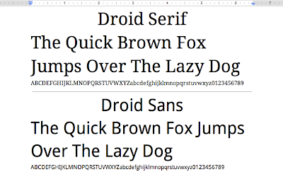
Every day we have many people import documents from Microsoft Word into Google Docs. Today we’re making import fidelity better by adding two of the most popular Microsoft Word fonts. Calibri is a beautiful sans serif font characterized by curves and soft edges. It’s designed to be high impact. Cambria is built with strong vertical
serifs and subtle horizontal ones. It’s very legible when printed at small sizes.
 Consolas and Corsiva
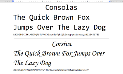
Consolas joins Courier New as the second
monospaced font in Google Docs. It’s a modern monospaced font with character proportions that are similar to normal text. Finally, Corsiva is our first italic font with embellished characters and an elegant style.

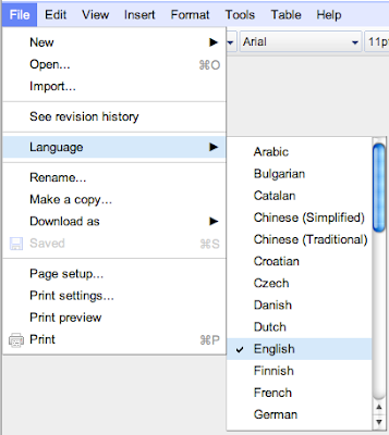
Right now our font support covers most Latin and Western European character sets. However, we’ll be adding web fonts for other languages (like Hebrew and Greek) soon. If you don’t see the new fonts in your documents, check that web fonts are
supported in your language and that the document language is set correctly from the File -> Language menu.

This is just the beginning of fonts in Google Docs. We added six new fonts today and we’re already testing our next batch. You’ll see many more new fonts over the next few months. And because Google Docs uses web fonts, you’ll never need to install a new font: when you load your document, the latest set of fonts will always be there, ready to use.
Finally, adding web fonts is just one of the challenges that the Google Docs team has been working on. If you’re interested in learning more about the challenges of building a collaborative application, check out the
first post of a three-part series on collaboration posted on the Google Docs Blog.
Posted by Jeremie Lenfant-Engelmann, Software Engineer