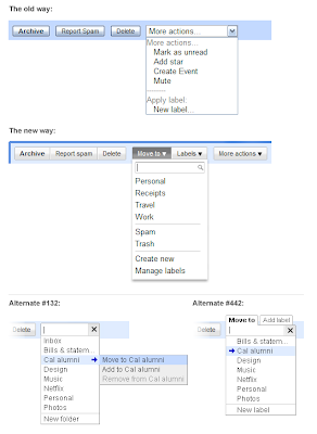
We also learned that if we made labels sound too much like folders, people got confused. For instance, while "Copy to" and "Add to" were easy to use, these terms made people think they were creating multiple copies of a message. "Move to" was familiar but didn't lead people to think they were creating copies. And people seem to have picked it up fast! Since the launch of the
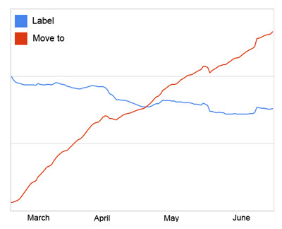
new menu buttons in March, we're seeing a 50% increase in new Gmail users trying labels in their first 2 weeks. And overall usage of the "Move to" menu surpassed that of the "Labels" menu within 7 weeks of launching:

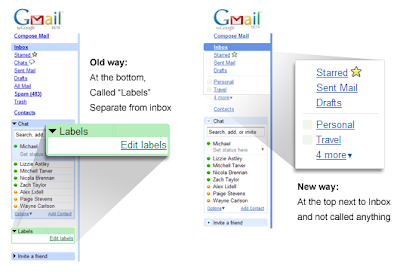
For our latest set of changes, we looked at how you access labels on the left side. In other email applications, folders get the royal treatment and are given a seat at the top near your inbox. But in Gmail, labels were stuck in a box below Chat — almost like we were telling people, "you don't want to use these." In testing, we discovered that it worked best to remove the terminology altogether and just place custom labels right under the system labels (e.g. "Inbox"):

The last step was to add drag-and-drop. Now, you can drag mail into a label, or even drag a label directly onto a message:

Making it easier to process and organize your mail requires more than just labels, but we hope these changes start to improve the process. We have much more in store, so stay tuned and keep the
feedback coming.
Posted by Michael Leggett, Gmail User Experience Designer